STATEMENT OF INTENT:
For my theme in this project I chose groups. I chose this theme because I feel like I have objects and materials that could be easily used to tell a story or convey a specific message. I want to explore objects can be grouped together in different ways to form different meanings. I intend to carry out research based on this theme by looking at things around me in my daily life, such as objects, books and the people around me. I will try to research as many still life photographers as possible in order to collect different ideas and link them with my personal work. For example I would like to study jo Whaley, I will analyse and evaluate her work and identify the techniques they have used. I mainly want to link these photos with my personal life, so that I can, not only relate to my work, but also project my own views of society and my hobbies onto my work, as I know that will help me connect with my audience, as well as my photos. During this project, I want to complete two or three photoshoots, each with different meanings behind them. My first shoot will be about my personal hobbies and what I like looking at. This is to show who I am, without having to be too explicit with it. During this, I want to arrange my most important objects as if they were on my desk, which will involve things like old technology, pens, pencils, notes and things I use on a daily basis, like my bag or coat. I want to use different composition techniques with it too, as I want different outcomes. During my second shoot, I want to focus around one or two themes, for example death or love. This is because I want to be able to relate my work with my audience and I think that it would be really interesting to link multiple objects together, even if they do not have an obvious theme. I like subtle symbolism, and I want to be able to use that in my work. If I have time, I wish to make a photoshoot of objects which contrast with each other, having two different meanings in my photos. This could either be meaning, or colours, like monochrome and vibrant. I want to challenge myself with this project, so I wish to think through all my work as best as possible, ensuring that nothing is out of place.
My main inspiration is Jo Whaley. She uses different techniques within her work. This is because I want to photograph dark rooms and deep topics, like death and loss, since I know it can evoke strong emotions in my audience. I can also do this in photoshop, by adding overlays with the blending mode set at colour burn. This will make the picture look worn out and give it an effect I think is very creative. I will further experiment with camera settings, as each shoot will have different meanings and may have different outcomes depending on the ISO and white balance. In photoshop, I want to be able to recolour my pictures depending on what my intended product is, as well as add them into a gallery and make a physical project out of my shoots. This could include making displays out of my objects or something as simple as drawing over them.
My final product will consist of a series of meaningful images, including personal interests and symbolism of different topics which will instill different emotions in my audience. After every edit and shoot, I will include annotations to explain the meaning behind each piece and explain the process of how I took the pictures and why. I hope to learn more about composition of objects and hidden meanings during this project, as I think it will help me in my future photography journey, as I will be able to see hidden meanings in objects in real life, rather than just in those that were placed in specific ways.
INITIAL RESPONSE TO PROJECT:


ANALYSIS 1

CONTEXT;
For my first analysis on this project I chose an image by Jo Whaley. Jo Whaley is a multi-gifted and a very creative individual, she was born in 1953 San Francisco Bay Area where she graduated from the University of California. Her works were exhibited for more than thirty four years and are held in the permanent collections of the San Francisco Museum of Modern Art. Whaley has also made her own book called "The Theatre of Insects". Insects and nature are a massive part of Whaleys photography which I fondly appreciate since I adore nature and find bugs grotesque yet fascinating. They can be beautiful and a little perplexing because of how different their appearance and behaviours are to humans and other animals. but thats exactly what Whaley empahsises by comparing butterflies to the human pelvic one. insects are quite alien and foreign, they have so many different variations , shapes and forms. They are miniscule but can cause havoc by just existing, they can be highly dangerous or infectious if in big masses. Insects behave like army's but are usually quite peaceful in comparison unless disturbed or threatened.
Whaley initially yearned to be a painter which is quite apparent in her photos because she sometimes paints on the things she's taking photographs of. I really resonate with that sort of mix of arts since I myself am a painter/illustrator and photographer. Whaleys work really stood out to me because of her themes of decay/death and the concept of time wearing down on objects/beings and very often fruits. I find that concept extremely clever and intriguing since that's what eventually happens to everything. And although I like the concepts and ideas of her works I also really like the contents of the photos themselves , for example I really love the use of nature in her works like the bright green foliage with pops of warmer colours from the occasional flowers. And I'm very draw to the the dark , doomy and brooding sky in the background which really contrasts all these bright colours and the context of this photo. The weather doesn't match with the objects and it looks like its about to rain but someone has left their things out to dry, its abstract and paradoxical. It creates a sort of juxtapose between the gloomy sky and the joyful flowers. I think that the sky adds a lot of mystique and personality to this image. I just love how exaggerated it is and I know for a fact that the image would look completely different and radiate a whole other vibe if the sky didn't look as it does. I also feel like I was drawn to this image because of how similar it looks to the music video for the song “Black Hole Sun” by Soundgarden
here's an example:


In this picture, the first thing you might notice is the torn and mauled up shirt as well as the ripped book with a stab wound that is situated right in the core of its heart which have been carelessly put up and left to dry in rainy weather. I believe that this could symbolise the negligence a child might feel from their parents. For example the tarnished book could be the child's diary and maybe their potentially abusive and neglecting parental figure has mutilated their feelings and have now strung the diary up on display in the cold and wet weather, where it can be exposed and vulnerable to everything in its surroundings (like a childs confused feelings). I think that this image has a childish and very playful aspect to it, for example, the overly saturated and contrasted colours and the very abstract context of drying your things during a storm. The next thing one might notice while observing are the bright orange petunias that are overgrowing towards the strung up shirt. Orange petunias symbolise anger and resentment which could be the by-product of negligence; as the child grows up (just like how flowers grow) they start nurturing and developing hatred, loathing and abhorrence towards their inattentive and disregarding parents. Thunder symbolises chaos and madness, which could suggest the disarrangement in the family. It could also mean that there's loads more of where all the wounding behaviour and scarring words came from; the storm could symbolise that more and more of those words and mannerisms are building up and brewing over time, until hell breaks loose and thunder starts rumbling and clapping (a big fight between the family). Furthermore, the shirt seems to have been eaten by moths. In some cultures moths symbolise bad luck and that could show how the child was cursed with bad luck from the beginning of their forsaken life; they didn't choose this fate and never chose to be birthed in such a horrible environment. However, it could also symbolise death or abandonment, for example the person who had hung up all these things has now passed on and has left their materialistic belongings to rot away and never be used again. In some way it's almost like the objects (shirt , book , etc...) have died along with their owner.
Jo Whaley cleverly demonstrates her expertise in this field not only through her storytelling, but also through her use of composition. The composition of the flowers flowing and growing towards the shirt from one end to the other; it creates this line that the viewer can naturally follow with their eyes. It's phenomenally harmonious and free; it seems so natural and uncoerced, almost like the flowers grew that way themselves. The photo seems well framed so it could suggest that Whaley has used a tripod to take this photograph. Whaley creates a perfect example of background, middle ground and foreground, which creates a great sense of stability in all 3 parts. For example, the background (the dark sky) is a very interesting choice, the middleground (the shirt and book) is where most of the story is and where the central focal point is. Lastly, the flowers in the foreground bring a pop of colour into the image.
I like this image because, It's very visually interesting and appealing to me. I love the decay and shredded objects that look old because I have a soft spot for old things. I feel like I could use jo Whaley's style as inspiration to make something original and new. For my work I'd like to use layering and story telling of some sort which is clearly portrayed here.
ANALYSIS 2

The photograph "Lotus Prophet" is a captivating piece that invites viewers into a realm of contemplation and mystique, by Anna Tomczak. She was born in Florida and now lives in Lake Helen. She has a signature style of taking photos with the massive 20 x 24 polaroid which gives her images a distinct texture, colour and style, "Lotus Prophet" Is a part of her collection “Earth Tarot” where she creates her own renditions of tarot cards as creative pieces of photography. She uses objects colours and symbolisms to depict the tarot cards individual meaning.“Lotus Prophet” appears to depict a mystical figure, perhaps a sage or prophet, immersed in a moment of deep reflection or meditation. The surroundings suggest a tranquil setting, possibly a sacred or natural space conducive to spiritual practice. The figure's posture and demeanour convey a sense of inner peace and wisdom, evoking themes of spirituality and enlightenment. The title, "Lotus Prophet," offers insight into Tomczak's interpretation of the work. It suggests that the figure depicted may possess prophetic qualities or serve as a conduit for spiritual wisdom. Additionally, the mention of lotus further reinforces the theme of enlightenment and purity.The title enriches our understanding of the photograph by providing context and guiding our interpretation. It prompts viewers to consider the symbolic significance of lotus flowers and ponder the possible prophetic nature of the figure depicted. Lotus flowers are known as symbolisms for strength, resilience and rebirth which could suggest the religious concept of death and rebirth or more commonly known as the samsara cycle which is the buddhist belief of the cycle of life . The theme of "Lotus Prophet" revolves around spirituality, enlightenment, and the quest for inner wisdom. The photograph invites viewers to contemplate the interconnectedness of nature and spirituality, as symbolised by the lotus flowers and the figure's serene presence. The message communicated is one of transcendence and inner peace, encouraging viewers to seek enlightenment and spiritual fulfilment in their own lives.
The composition is carefully crafted, with the lotus flower positioned prominently in the foreground, drawing the viewer's focus to the dark, ethereal figure looming in the background, The placement of the figure is off-centre which adds to the sense of ambiguity, drawing the viewer's attention while also allowing for the surroundigng environment to play a significant role. The lotus flowers, with their symbolic connotations of purity and enlightenment, frame the subject and contribute to the overall atmosphere of serenity and spirituality. While "Lotus Prophet" contains elements of portraiture, landscape, and abstraction. The figure serves as a focal point, but the photograph transcends mere portraiture by incorporating the surrounding environment and imbuing it with symbolic significance. At first glance, the image presents a juxtaposition between the delicate beauty of a lotus flower and the mysterious presence of a human figure cloaked in shadow. The composition also utilises strong leading lines to guide the viewer's gaze towards the focal point, the lotus flower. The curving stem of the lotus, as well as any surrounding foliage, may serve as leading lines, directing attention towards the central subject.
I find that this form of art really resonates with me and Anna Tomczaks photography has inspired my project since it will follow the theme of religion and spirituality too. In conclusion, "Lotus Prophet" by Anna Tomczak is a thought-provoking work that combines elements of portraiture, landscape, and abstraction to explore themes of spirituality and enlightenment. Through its composition, title, and symbolic imagery, the photograph invites
SHOOT 1:


BEST:This image stood out to me because I like how I have used the rule of thirds (the candle , the charcoal and the cross) I also enjoy the colours that the fire has produced which match the atmosphere I'm trying to capture really beautifully. I used an ISO of 400 since it gives a nice dim lighting to the images I take. I also used F16 F-stop which gave me nice sharp edges. I also really like how the warm tones like the fire and the red charcoal rapper contrast with the cool green from the Ivy. Ivy symbolises faithfulness , fidelity and loyalty to Christ which further deepens the the meaning behind the imaged. I also think that the metal from the icons reflecting the light from the candles looks really neat and adds a further grace to it. Furthermore I used the rule of thirds by focusing on those 3 objects which is naturally appealing and attractive to the eyes.
|

|

|
WORST:I know that this image looks really identical to the one I titled as one of my best but this image has a very unflattering angle and composition, I have a lot of empty and dead-space (the table near the front that's empty). The cross in the back has tilted to the side which doesn't look appealing and the charcoal is placed in such a weird angle that you can barely even see what it is. the balance between each object is way off. I also think that it just looks uneven ,messy and chaotic. I don't think anything in this image has turned out well. I used the same ISO as before (400) but what messed up the image the most was my F-stop of F/4 and my positioning , my angle and my composition rather than my ISO.
|
BEST:I have chosen this as one of my best images because I love the warm lighting reflecting against the metal on the Icon of the Virgin Marry, I also enjoy how the green Ivy has also reflected some of that red lighting which gives them a bit of a brown tone. I think the dim red lighting really resembles the warm lighting produced by the candles in a real church so I believe I did a good job with capturing that sort of essence I was going for. I also fancy how you can slightly see the other icons and the rosary peeping out from the background. Generally I like the overall composition of the image. I used an ISO of 400 which gave a dim and cozy look that it usually gives me (which is why I use it). I used a central focal point (Virgin Mary) Which I believe worked really well since her face is what I notice the most when I look at it.
|

|
|
WORST:I feel like this image had a lot of potential (the flame looks beautiful) but the photo is too red and its too high up (you cannot see the whole icon) There are many blank areas and dead-spaces all around in the image for example the right side feels empty but the left side looks messy and over-crowded, the butterfly is also out of place and quite random. I believe that if the image was less red , more to the left and lower down it would potentially be a useable photograph. I used an ISO of 200 which gave it that really bright red colouring but made it overly dark although I also fully covered my light with a red gel which made it too red.
|
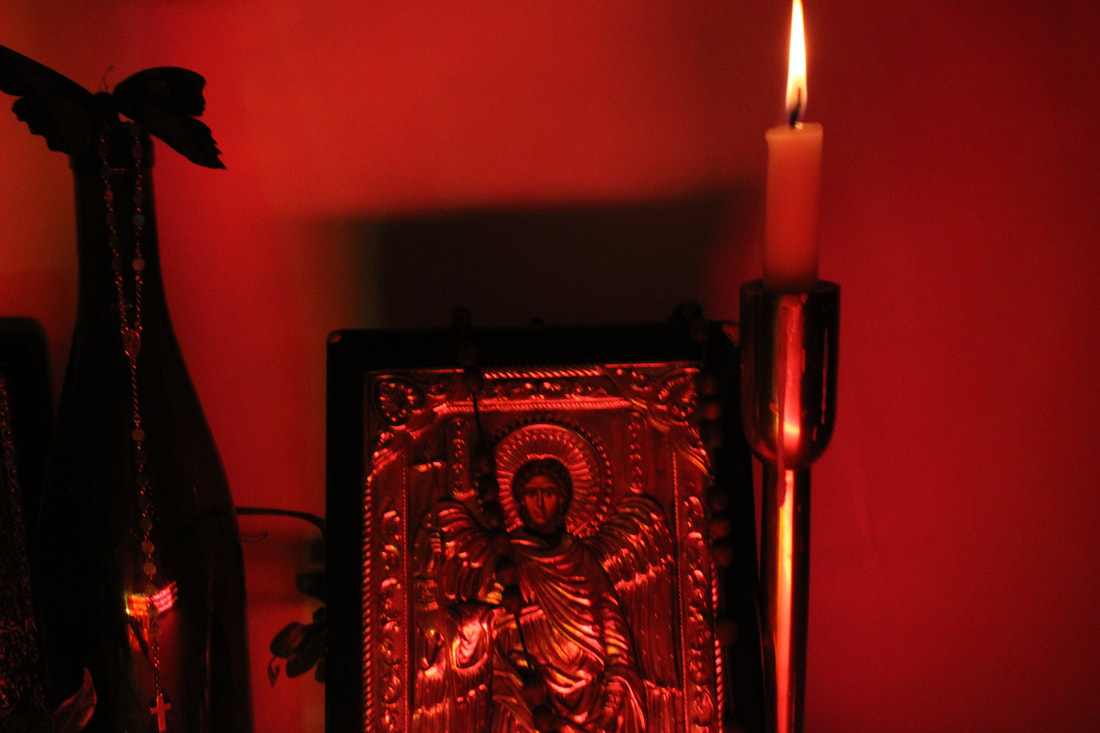
BEST:This photo is like perfect to me I cherish the way you can see that bright and beautiful flame and the way the candle has sort of melted in the middle, I also fancy the orangey and reddish lighting produced by the combination of the gel and the candle reflecting on the metal icon of Archangel Michael. The rosaries position is also very effortless in a perfect position. I have noticed that there's this gorgeous shadow produce on the wall that is orange , yellow , red and also has a slight pop of green which I find extremely harmonious. I also really like how the image captures the minute details and symmetry of the carvings around the icon.
|

|

|
WORST:This image wouldn't be in my worst if it wasn't for the messy left side and the dead-space on the right (its also quite out of focus which is also why its on my worst) but I do think that if I had fixed those mistakes it wouldn't be a half bad image. I feel like the icons overlapping each other look really well, what ruined it was the F-stop of F/4 and the composition of the other objects surrounding the icons and cluttering up the left side and the ground. I also think that the lights look pinkish and green which sort of makes it look out of place (it looks like the icons have been placed in a club rather than a church.)
|
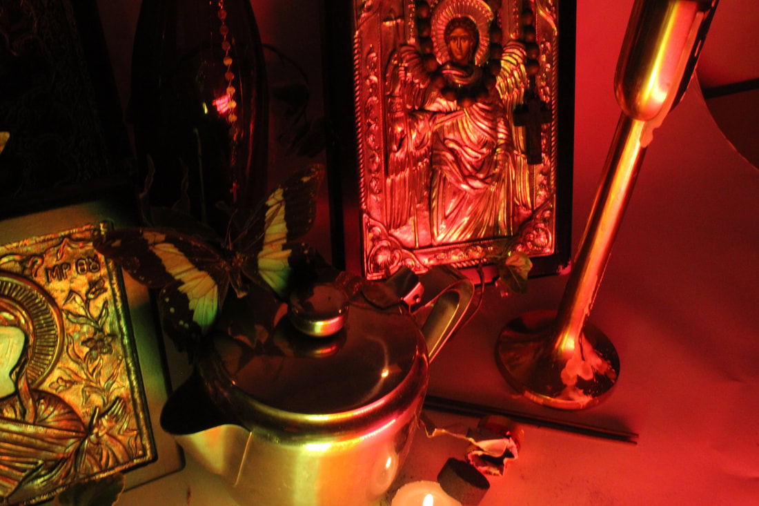
BEST:I really love how this image has a less extreme lighting its more natural and minimal but I adore how the candle light reflects on the metal. I also like how its really up-close and cant see the whole icon but rather cuts off into another one in the back. The rosary also adds a nice element since the wooden texture centrists with metal and matches with the painting from the inside. I also know that the sort of candle i used isn't traditionally used in churches but it was the only thing i had available and I also think that it adds a nice interesting gesture with those shapes from the pot.
|

|
|
WORST:I feel like this image deserves to be in my worst because it just looks random and nothing really correlates , the faces of the icons are also reflecting light which makes them look faceless think the butterfly didn't serve the purpose I though it would and the pot was misplaced in this sort of composition its in. you can also see the fake background in the right corner (my white paper backdrop is shown)
|
BEST:This is one of my brilliant photos the colouring in this image is phenomenal I love the pinkish and slightly blue shadows that have been produced and just the orangey yellows from the candles are just beautiful, even though you cant fully see the objects I like the concept of capturing the beauty produced by the objects rather than the beauty of the objects for once. The objects are still in the image for example half of the icon and the bottle. I used an ISO of 400 which gave me the expected beautiful results it always gives me.
|

|

|
WORST:This image is one of my worst ones and you can clearly tell why. Its smudged and blurry , you can see my fake background , the objects are positioned horribly there's absolutely no harmony or grace between them, and the angle is way too high up and loose. the candles are also extremely bright and glowing which would usually be seen as positive thing which is clearly not the case with this image here. I used an ISO of 800 which is way too bright and my aperture is what caused my image to be so blurry and smudged.
|
SHOOT 2:


|


|
SHOOT 3:


EDIT 1


EDIT FOR EXAM PROJECT: PICTURE BOOK/BIBLE QUOTES.
STEP BY STEP GUIDE TO MAKING A HOMEMADE BOOK:
MATERIALS NEEDED:
Paper
Cardboard:
Cloth or fabric of some sort
Glue: plain glue
Needle and Thread or Stapler: for the traditional bookbinding method
Cardboard:
Cloth or fabric of some sort
Glue: plain glue
Needle and Thread or Stapler: for the traditional bookbinding method
INSTRUCTIONS:
PAGES:
Take each sheet individually in portrait orientation, and fold them horizontally through the middle. Then, fold it back the other way to make tearing easier. Next, lay the sheet of paper down flat and tear it down in the middle.
Once you've torn all the sheets, take two and fold them down the middle. This will create one signature. A signature in a book is a group of pages that are all bound together. A collection of signatures creates a book! You can't just put all of your pages in one giant signature because when they're folded up, they won't look even. I used four signatures in my book.
SEW BINDING:
Cut a large amount of thread, as you'll want to double it up while you're sewing. Thread your needle and pull it to the very middle of the string. Tie the two ends together in a double-knot.
One of my mistakes was binding with no rhyme or reason. I'll explain what I did, which worked, but I'm also going to let you know
Start with the top of the first signature, threading from the back to the inside of the middle fold. Continue this to the bottom of the signature, weaving at about 1" intervals. Once you're at the bottom, grab another signature and line it up with the first. I did the same sort of sewing pattern, but I crossed the threads along the spine. My intention was to keep it all held together.
I proceeded the same way until all of the signatures were added. Then, I tied off the end and cut the excess string.
COVER:
Cut out a piece of cardboard that is about two centimeters wider and four centimeters taller than your opened book. Cut it in half to create your front and back covers.
Take your front cover and glue it to the first page of your book. The cardboard should have a 1-cm border around the top, bottom, and left sides of the page. Repeat this with the back cover
BOOK EXAMPLE/TEST FOR REAL EXAM BOOK:


WORK COMPLETED IN 10 HOURS:
SESSION 1:


BEFORE: |
AFTER: |
|
|

|
FINISHED EDIT:

SESSION 1 EDIT 2:


BEFORE: |
AFTER: |
|
|

|
FINISHED EDIT:
SESSION 2:


BEFORE: |
AFTER: |
|
|
|
FINISHED EDIT:

SESSION 2 EDIT 2:


BEFORE: |
AFTER: |
|
|
|
FINISHED EDIT:

SESSION: 3


FINAL GALLERY:


EVALUATION:
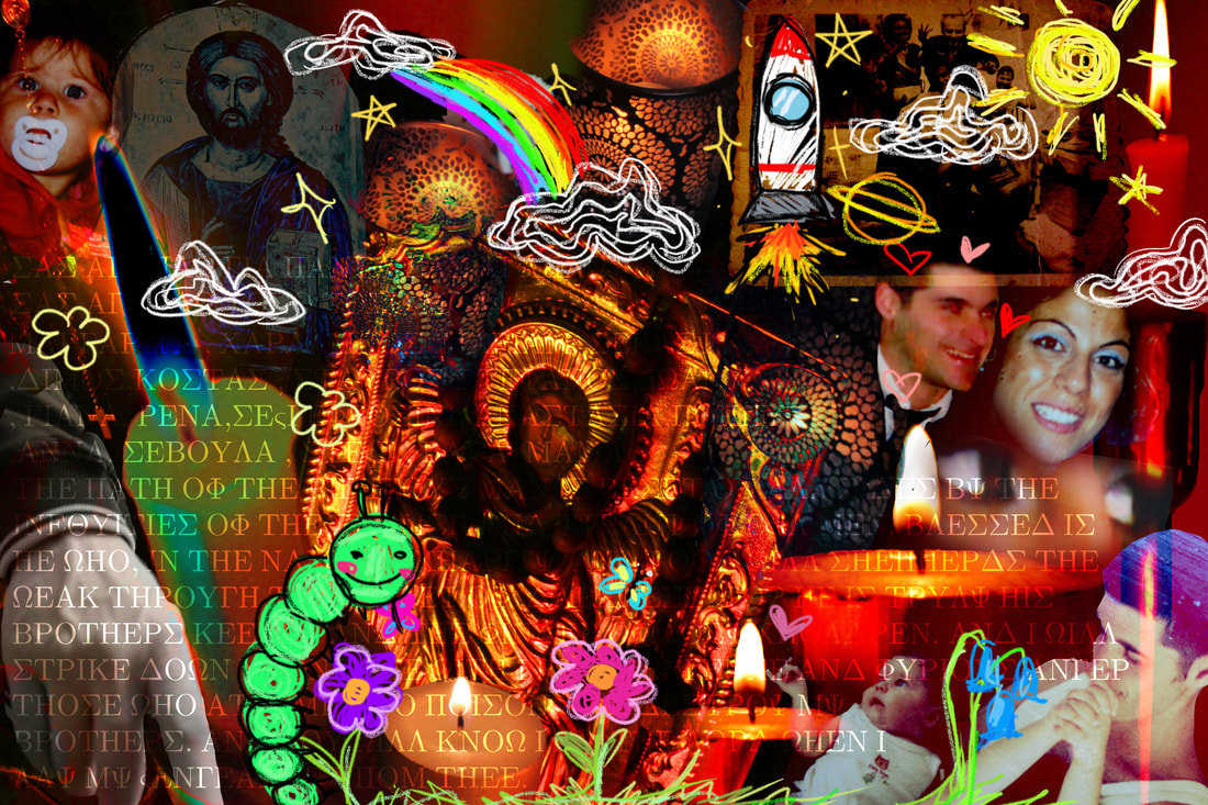
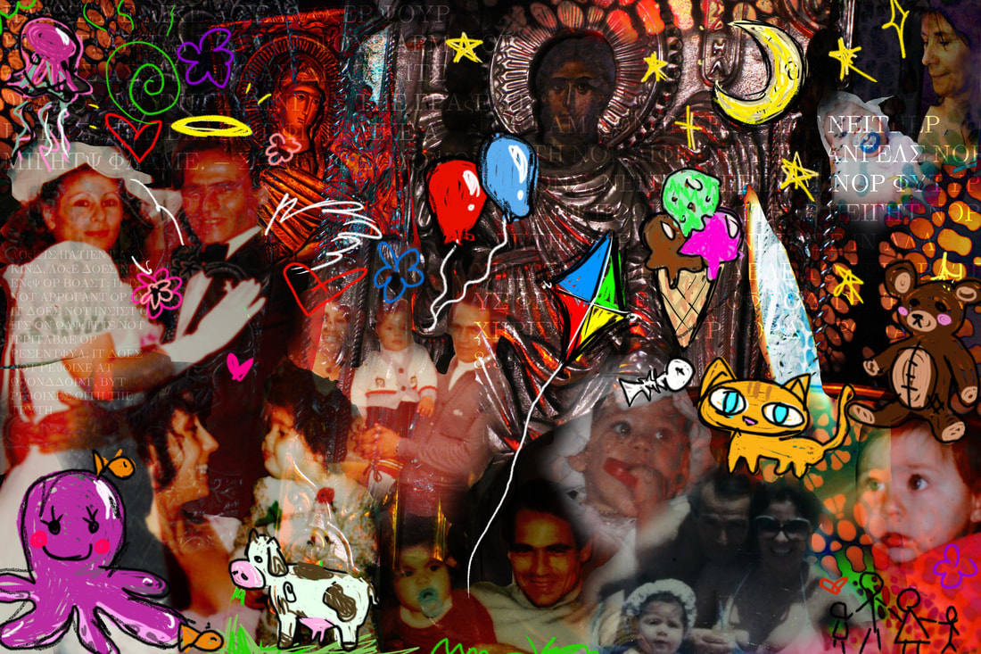
Throughout my last project/exam, my family and religion were at the forefront of my mind. I wanted to create something that would pay tribute to my entire family, those who have loved and cherished me, and all the memories we have shared. The result was a memory book that encapsulates the nostalgia, family bonds, and cultural roots that shape my identity. As I worked on this project, I found myself drawn to childhood memories, using childlike images and colours in my edits. These deliberate choices were a reflection of the innocence and joy of youth, a time when everything seemed brighter and more vibrant. The pieces I created were not just about nostalgia, but also about family and culture, elements that have shaped me into the person I am today. The impending move of a very important member of my family added a sense of urgency to my project, as I grappled with the emotions of missing them and longing for the past. I channelled these feelings into my work, creating a dreamlike quality with bright, beautiful colours. These colours not only evoke a sense of whimsy and playfulness but also represent the vividness of my memories with my family, filled with warmth and sunlight. It was as if I was looking at the world through the eyes of a child, seeing the beauty and wonder that surrounds us. Incorporating religious elements into my project was essential, given the profound influence of religion on my life and upbringing. As an Orthodox Christian, my faith has always been a source of comfort and familiarity. The serene and peaceful atmosphere of the church brings me a sense of security, reminding me of my grandmother and her unwavering devotion to her faith. Including religious imagery in my project was a way to honour this important aspect of my identity and pay homage to the values that have been instilled in me since childhood. Creating this project felt like a memorial to my family, a way to capture the essence of who we are and the love that binds us together. As I approached the end of this chapter, I wanted to infuse the project with sentimental value, making it a lasting tribute to the people and experiences that have shaped me. To further celebrate my Greek background, I incorporated Greek text into my project, adding another layer of cultural richness and personal significance. The decision to make a video showcasing the progress of my memory book was a way to document the journey and share the evolution of my creative process with others. It was a way to invite viewers into my world, to see how my family, memories, and faith intertwine to create a tapestry of love and connection.
As I reflect on this project, I am filled with gratitude for the opportunity to honour my family, my heritage, and my faith through art. Each brushstroke, each image, and each color was a testament to the love and memories that have shaped me into the person I am today. This project was not just an assignment; it was a labour of love, a tribute to the people and experiences that have made me who I am.
As I reflect on this project, I am filled with gratitude for the opportunity to honour my family, my heritage, and my faith through art. Each brushstroke, each image, and each color was a testament to the love and memories that have shaped me into the person I am today. This project was not just an assignment; it was a labour of love, a tribute to the people and experiences that have made me who I am.
