STATEMENT OF INTENT:
For my student choice, I chose architecture as my subject because I have a strong vision for how I want to approach this project. Specifically, I aim to capture the beauty and grace of old architecture with its intricate details and timeless charm. To achieve this the manipulation of light, shadows, and color will be key in bringing out the architectural details. To stimulate my ideas and get my head spinning I have researched and drawn inspiration from artists in the field of architectural photography such as Walker Evans, Saul Leiter, and Clarence John Laughlin. Their work has had a significant impact on me, as they were able to create evocative and atmospheric images. I have also drawn inspiration from Hannah Höch, an artist who was not in the field of photography but rather in the field of Dadaism a well-known movement using art to protest against war and politics in the early 20th century. Höch's ability to blend different elements and create collages with a sense of surrealism and Evan's , Leiter's and Laughlin's captivating images have all left a lasting impression on me. Their unique styles are characterized by moody lighting, soft colors, and a sense of mystery. To express my creative vision fully I plan to not only capture the essence of old architecture in my photographs but also add my own artistic touch. I want to experiment with incorporating unexpected elements into my architecture inspired by surreal and dreamlike concepts. I intend to print my edited photographs and arrange them into a collage. In this collage I plan to edit my images in a way that adds a vintage touch, with subtle yellowish tints. I will be merging different buildings together and creating a surreal blend of architectural structures and human features. By incorporating random body parts, such as eyes , hands and so on. I hope to evoke a sense of intrigue and curiosity in the viewer. By combining different elements and techniques, I hope to create compositions that are both visually striking and emotionally captivating. Additionally I also want to include snippets from books, newspapers, and even some of my own drawings to further enhance the traditional aspect of my edits. I am particularly drawn to the gothic styles prevalent in architecture and surely enough I am very fortunate to be in Manchester since it is a city a city known for its rich architectural heritage, particularly in the gothic style. The abundance of old churches and structures from the past provides me with chances to capture the essence of my vision. I am fascinated by the intricate details, soaring arches, and haunting beauty of gothic architecture and I am excited to explore these elements in my photographs. Additionally I plan to include elements from nature, such as foliage to create a mossy and ancient aesthetic. This organic fusion of nature and man-made structures will add an intriguing dimension to my work.
Since I prefer a hands-on and physical approach I plan to make edits by cutting, sticking, and drawing directly on the photographs. To document my progress and showcase my creative process, I will take photos and recordings of stages along the way. These photos and video clips will be accompanied by written explanations and annotations. These visual and written elements aim to provide my creative process and artistic journey. For this project I will need a sketchbook. This sketchbook will serve as a space which will be where I can organize and explore my ideas. I will also need the basic and essential materials used in collages and drawings such as a pen , a pencil , glue and scissors. While this project presents challenges in terms of documenting the physical process, I believe that capturing photos of my progress and equipment, along with explanatory captions, will effectively convey the process throughout. Although I may not be able to rely on the snipping tool I think that this alternative approach will capture the essence of my project just fine.
In conclusion, I am truly excited to get started on this project. With my passion for art and craftsmanship a physical medium feels like the perfect fit for me. By combining photography, collage techniques, and art, I aim to create mind-boggling and visually captivating images. So I think that a physical project will be loads of fun and will also allow me to push the boundaries of my creativity and unlock new artistic possibilities.

STUDENT CHOICE (ARCHITECTURE ANALYSIS

The photographer who took this photo is called Walker Evans. He was born in St. louis, Missouri on the 3rd of November ,1903. He died on the 10th of April , 1975. He was an American photographer and photojournalist best known for his work for the Farm Security Administration (FSA) documenting the effects of the Great Depression on farmers , stock , suppliers , animals and buyers. The fact that his job had to do with documenting the effects of the great depression is also one of the main reasons he took this photograph and most of his other photos too. Many of his works have been placed in museums and old time magazines of his time. Not only were his photos a true look into the life of people living through the great depression shown through his marvellous photos but he also was a great source of historical context for next generations to come and still is a great source of education, I myself have learnt more about the great depression and about the 1920s to 1930s by researching Walker Evans's life and works. during his early life He attended the Loomis Institute and Mercersburg Academy, then graduated from Phillips Academy in Andover, Massachusetts. He took up photography in 1928 , He published his first three photos in 1930 on the poetry book "The bridge" by Hart Crane. His photographs captured street life, like beggars and people stricken with poverty , police officers , dock workers and grave yards. Evans most thriving moments of his career was ironically the great depression.
It's a photo of a Ford factory , somewhere where labour usually occurs. But now its empty and abandoned , that's because between 1923 and 1932 Ford motors were forced to lay off all of their workers. During the great depression 9,000 banks went out of business, 9 million savings accounts were wiped out, 86,000 businesses failed and wages decreased by an average of 60%. People were struck by poverty and despair. By 1932, one of every four workers were laid off and unemployed. The photo has a depressing and eerie feeling to it, it's a little off putting. I think it's because factories bring labour and famine into mind especially abandoned factories that closed down due to the side effects of the great depression. Evans achieves this sort of mood and feeling by taking the photo during mid day (almost night). Evans uses the rule of triangles by using the buildings complex structure. The rule of triangles creates a sense of harmony , balance and stability, Evans could have tried to ironically create that sense because the great depression is the outright opposite of harmony and stability. It's also light and dark but with a yellowish tint that gives it a malicious and old feeling. It's a really realistic photograph because it's very normal looking, there's nothing out of the ordinary taking place. I feel like Evan's took this monotonous photograph to emphasise and demonstrate how the world's day to day life was like during the great depression, poor , empty and deprived of any form of joy. As it's called the great depression it doesn't only talk about how money was depleted but also how the people were drained and depressed since they were living during the middle of 2 world wars. Evans has used leading lines but differently. Normally leading lines go towards the same direction but these leading lines/buildings form a triangular shape. This is also the rule of triangles which is when straight diagonal lines overlap and make a triangle. This can also happen with lines that aren't fully formed. You can make a shape with a bunch of different objects in a specific order that looks triangular (the viewer will automatically fill in the lines visually) by overlapping one another it makes the viewer follow the triangle because when you look at one of the lines it will then lead you to another line so you're slowly seeing the whole picture in pieces and then the lines finally lead you to the centre of the photo which is usually the focal point. Evans used an ISO of 200/400 because the photo was in during mid so then if the ISO was higher than 400 it would be very grainy but it's not exactly 200 so that it's not completely dark.
I really love and enjoy Evan's work it really matches my style of old and a little ambient it's something I'd definitely like to replicate in my architecture (the use of his shapes , shadows , light and darks and the feeling you get when you look at his work) his work had loads of meaning and his images speak for themselves, they capture the dream like feeling that most people felt during the great depression because of how delusory and unworldly their lives had become. It gave us real historical understanding of what people's lives looked like during such awful and horrid times which I also want to show (I'd like my work to have some meaning to it too.) In general I also just love the colour (yellowish tint of the image) and the abandoned factory he used (I like abandoned houses , hospitals , factories and psychiatric facilities.) Why I like abandoned places is because you can interpret your own story of what it was like before it was abandoned and can also interpret why or how it became abandoned which is a fun way to make a story for something that could've actually happened (and who knows you might actually guess right).

This photograph, captured by Clarence John Laughlin in 1946 holds great significance, as he was regarded as the most important Southern photographer of his time and earned the title "The Father of American surrealism". Born on August 14th, 1905 in Lake Charles Louisiana, Laughlin was a remarkably talented artist with a diverse range of artistic abilities. While his primary focus was photography, he also had a hidden talent for poetry and writing which he pursued secretly. As a child Laughlin was known for his introverted and shy nature but he shared an exceptionally close bond with his father which cultivated his deep appreciation for literature. Sadly in 1918, Laughlin suffered a profound loss when his beloved father passed away. This tragedy had a lasting impact on him, shaping his perspective on life and fueling his passion for the arts. Although he dropped out of high school in 1920, Laughlin was a highly literate man early age. Initially, his ambition was to become a writer or poet which is apparent in his works as he often accompanied his photographic creations with written pieces or poems inspired by the French symbolism movement. However it was at the age of 25 that Laughlin discovered his true calling in photography. He taught himself how to operate a camera and embarked on his journey as a freelance architectural photographer. His exceptional skills soon caught the attention of the US government who hired him for various projects. However Laughlin eventually grew distasteful with working for the government leading him to sever ties with the agency and pursue his personal creative ventures. Throughout his career, Laughlin tirelessly experimented with different photographic techniques and explored an array of captivating themes. These explorations ultimately led him to develop his distinct and renowned style one that would leave an indelible mark on American surrealistic photography. His photographs provoked a sense of intrigue, blurring the lines between reality and illusion, and capturing the imagination of viewers. Clarence John Laughlin passed away on January 2nd, 1985, leaving behind a profound legacy in the world of art and photography. His contributions to the field continue to inspire and influence artists around the world (such as me) which cements his status as one of America's most influential surrealistic photographers. In conclusion Laughlin's life and work exemplify the power of artistic expression and its ability to transcend boundaries.
To delve into this piece I will first break down the title of this image since the title on its own tells its own story especially in relation to the image. The title of the photograph is “The Apparition” the word apparition means a ghost or a ghostlike appearance/figure. Other words to describe an apparition would be phantom or spirit. This could symbolise death or grieving a death of a loved one. This title matches the image greatly since in this captivating photograph Laughlin skillfully captures the eerie essence of an old, foggy and isolated house. Laughlin overlays the image with a plethora of other houses creating a unique and thought-provoking dynamic. By using asymmetry Laughlin adds an element of chaos that intensifies the overall atmosphere of the picture. Moreover he incorporates the technique of double exposure. Double exposure refers to exposing the same frame of film multiple times, resulting in an enchanting overlaid effect that further enhances the artistic appeal of the photograph. The house in the background is facing the front while the house that is layered in front of it is angled towards the right; it gives the image an interesting composition. Layered in front of the house are two dark shadows, they could be the apparitions that are mentioned in the title one is seen waving towards the house which could mean that the “ghost” / shadows could be related or linked to the house (maybe died in the house or lived there).
In my opinion i find this image very haunting and captivating , I love the ambiguous feeling i get when looking at this image and id love to incorporate the sort of feeling of a dream like atmosphere almost like memories are lingering around like apparitions. I want to incorporate the shapes of the edifices and create a visual story around the memories and history of this city. I enjoy the idea of using pillars which symbolise strength and stability since they have been the support for buildings for millennia in human civilisation.

Herbert Bayer's “Lonesome City Dweller" is a compelling photograph that encapsulates the essence of urban solitude, capturing the isolation and anonymity often experienced within bustling city-scapes. To delve into its analysis, it's essential to understand the background of the photographer, the historical context surrounding the image, and the technical aspects involved in its creation. Herbert Bayer was an Austrian and American graphic designer, painter, photographer, sculptor, art director, interior designer, and architect, he passed in 1985. He was born in 1900 and was a prominent figure in the Bauhaus movement, The Bauhaus movement was a German artistic movement which lasted from 1919 to 1933 , Its goal was to merge all artistic mediums into one unified medium. Bauhaus designs are often abstract, angular, and geometric. He worked in various mediums, including photography, where he often experimented with form, light, and composition to convey complex ideas and emotions. Bayer's approach to photography was heavily influenced by his training in graphic design and his belief in the power of simplicity and abstraction. Bayer's photographic work often reflected his keen eye for composition, form, and abstraction. He embraced modernist principles, emphasising simplicity, geometric precision, and the exploration of light and shadow in his imagery.
"Lonesome City Dweller" This image reflects the existential angst and the disconnection people feel during this era. Bayer's use of ISO would likely have been influenced by the available light conditions. Given the urban setting depicted in the photograph, he might have a higher ISO to capture sufficient detail. The aperture Bayer likely chose was a relatively narrow aperture to ensure that both the foreground and background elements remain sharp. Bayer may have also adjusted the white balance to counteract any colour casts caused by street lighting or other surrounding factors, ensuring a neutral and darker colour palette enhances the photographs mood and atmosphere. I believe Bayer edited the image using collage techniques by cutting out the hands and eyes and sticking them together to make the “Lonesome City Dweller”. The image could've been manipulated physically by cutting and sticking and maybe colour correcting
In conclusion, Herbert Bayer's “Lonesome City Dweller" stands as a poignant exploration of urban isolation, skilfully composed and technically executed to evoke a sense of solitude amidst the bustling energy of the city. Through his genius of photographic techniques Bayer invites viewers to contemplate the human experience within the modern urban landscape, resonating with timeless themes of alienation and introspection.
I believe this image to be so encapsulating and visually appealing too , not to mention the mystique and tremendous atmosphere that's caused by the surrealistic hands with eyes, Bayer really had a viewer's eye and never seemed to miss. I Also love Bayer's use of the windows behind the eyes , it creates a sense of being watched by prying eyes. Not only the ones in front of you but the ones also lurking in the windows trying to get a fix of their daily gossip.
MOODBOARD CLARANCE JOHN LAUGHLIN:

MOODBOARD - WALKER EVANS


WALKER EVANS:
Walker Evans was born November 3rd of 1903 (very old) he is a photojournalist from America.
Five facts about his career
- Worked for Farm security administration (FSA) documenting the effects of the great depression
- Has worked in the national institution of arts and letters - He has received three Guggenheim fellowships
- He worked as a staff photographer for time and fortune
- And taught graphic arts at Yale
What I like about his photography was that it always had a feeling of loneliness in each photo or sadness you get a eerie vibe from the photos but It's so confusing because even when there's people in the photos they somehow look lonely and sad (but the sad part may be because it was during the great depression) I also like the vintage yellow tint since the photo actually is old and i really like how he uses shadows of buildings it's so Smart I just love how he takes advantage of his surroundings
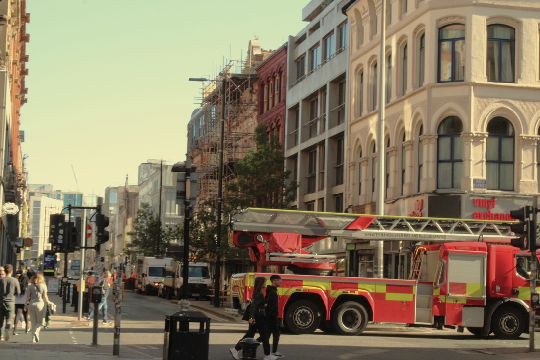
Here I have some work from my mobile phone. I have taken photos of around my neighborhood and some other places around Manchester.


PLAN FOR PHOTO SHOOT:
|
Project Title/ shoot number: Architecture for student choice
Description of aims for shoot: To take photos of old looking buildings and get many different elements I'm getting the older style ideas from walker Evans and Clarence john Laughlin since these two photographers were photographers in the older times and I'm taking the poster looking feel from Saul leiter since his photos always looked like they came straight out of a magazine which then I can add together to make bigger pieces that look almost like collages (I'm thinking of editing physically by cutting up and sticking and drawing on the photos that I have taken Links with Photographers Saul leiter , walker Evans , Clarence john Laughlin Location: The streets of Manchester/school Props/ items needed: None needed I think Kit needed e.g. lighting, tripod, backdrop, macro lens: Just a camera Camera settings I will use: F-Stop : White Balance: Shutter speed: ISO: 400 Which compositional rules will I use? For architecture most of these apply even if you don't intend to add them for example leading lines can be seen a lot in buildings and hallways because of symmetry. |


|

|


|
|


|
|


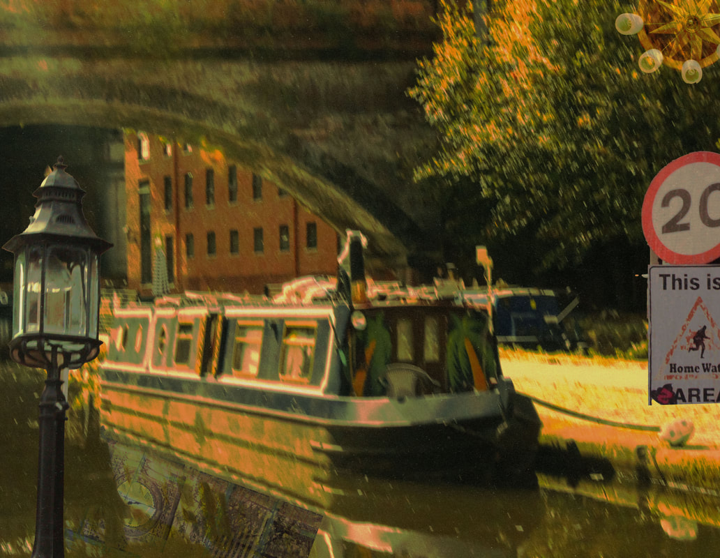
BESTI really cherish this image because of the colours , the lighting and the overall mood. I feel like it captures a very serene , tranquil and peaceful moment. I'm really keen on how isolated it looks, there's no one there but the little boat which kind of reminds me of movies with hidden places like in "Howls moving castle" were there's a secret garden full of flowers and a solitary house. To achieve this look I made the boat the central point of the scene which draws the viewers eye towards the boat and I used an ISO of 400 which is my standardized ISO for most of my best images since it gives a nice bright but also a little dim lighting to the images I take. I also used F16 F-stop which gave me a crisp and clean look.
|

|

|
WORSTTo be honest I didn't even want to upload this photo on my gallery because it ruins my aesthetically pleasing photographs but I had to. so this image is way to bright. because I used a ISO of 800 the composition is completely random and whacky , there's someone's feet on the bottom left corner and the colours are just not working well. Looking at it, it doesn't make me feel anything, like if I saw this image I wouldn't think "wow this photo is very eerie or peaceful or joyful" because this photo doesn't have any sort of tone to it.
|
BESTThis image is angelic the lighting is warm and sunny, the organ looks rich and the warm lighting reflects on the golden pipes beautifully. I really find the contrast between the the yellowish orange tint and and the brownish black patterns very pleasing. There's also a bright beam of light at the top corner of the image which makes this photo look divine which matches the image really well since its inside a church. I used an ISO of 400 as per usual but obviously its my preferred ISO for a reason as it works wonders.
|

|

|
WORSTI believe that this is one of the worse ones , sadly I really really like what I was taking a photo of but my aperture was too low and made most of the window photos shaky which is super unfortunate because I was mostly excited about getting photos of the light shining through the stained glass. the photos shaky , off center and the lighting doesn't really complement the bright window (it would've been better if everything surrounding the window was darker so that the brightness of the window would pop through more.)
|
BESTI believe that this image is really dreamy because of the faint reflection of the glass and the soft warm colours, it feels like something you have seen before something from a distant memory and I just love the way its street photography but from a perspective were it wouldn't be normally taken in, weirdly enough its almost like its in the perspective of a stalker taking photos of something or someone they aren't allowed to photograph. I used the standard ISO I always use (400) which gives me the nice bright but dim lighting.
|

|

|
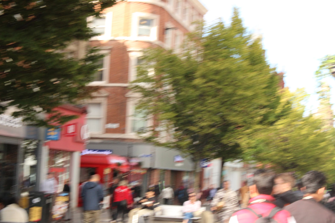
WORSTI think this photo is the worst one from that bunch because the colouring isn't similar to the others it doesn't have much of that yellowish pink tint some of the others had , the lighting is way too bright because I used an ISO of 800. i also just don't think there's anything intriguing , noticeable or special about this image maybe if the photo of that building was taken from a different perspective with different settings it could've turned out differently.
|
BESTI find this image very pleasing because I like how the lines overlap with each other and how the pinkish/red tones are very prominent. I also like how the little bits of orange and blue on the construction planks contrast each other since blue and orange are on opposite sides on the colour wheel and are a very common colouring scheme amongst art , photography and cinematography.
|

|
|
WORSTYou can tell by just looking why this is one of and maybe even the worst photo of all , its shaky , out of focus and there's literally nothing even remotely interesting in this image. no interesting colours and no interesting subjects at all everything about this image has gone utterly wrong in some way , shape or form. also the lighting is way too bright because I used an ISO of 800
|
BESTI really like this photo because I love the subject it was something I was actively looking for I was looking for old looking machinery , something rusty with loads of compartments and nuts and bolts and I love the little shapes formed by the cobwebs that the machine is covered in. I also fancy the colour of this machine since green is quite literally my favourite colour. I used an ISO of 400 which gave me that perfect crisp lighting and shading.
|

|
|
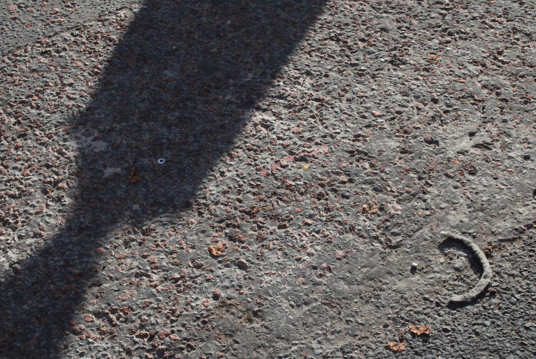
WORSTI really don't like this image just because of how boring it is there's literally quite nothing really happening or going on and there are absolutely no colours to make this even remotely interesting. I am also not photographing the subjects that I am supposed to be photographing for this project since I am not doing light and dark or shadows theres nothing really architectural in this image. Even the most interesting part of this photo (the shadow) has no definite shape that makes it flashier.
|
MOODBOARD FOR EDITS


EDIT 1
Although this project is going to be a physical editing project I will also use photoshop and editing programs to change the colours , lighting and to crop a few of the images I will be using in my edits. So first i will edit them on photoshop and then I will print them , cut them and glue them together on a sketchbook.


EDIT 1
Here are all the images I used for my first edit , some images are unedited since I liked them the way they are.


EDIT 1 FINISHED

EDIT 2


EDIT 2 FINISHED


EDIT 3


EDIT 4

MOCK EXAM EDIT


FINAL GALLERY:


EVALUATION
During my student choice project, I embarked on a journey of exploration, delving into the realms of physical and digital art to create dreamy images that resonated with styles like surrealism and dadaism. Inspired by the works of artists such as Hannah Höch, Allan Walker, and Clarence John Laughing, I sought to infuse my creations with a sense of eeriness and architectural elements, even though my emphasis on colour diverged from the monochromatic tones of these artists. Despite this deviation, I found solace in the end results of my project, appreciating the unique dimension that each artist brought to their work during challenging times, like the Great Depression and political scandals. As I immersed myself in the study of these artists, I recognised a common thread of seeking escape and freedom through art, a sentiment that added depth and emotion to their creations. The feelings evoked in me when I gaze upon their works serve as a testament to the power of pouring one's soul into artistic endeavours, a concept that I strive to emulate in my own projects. While I may not yet possess the ability to evoke profound emotions in viewers, I take pride in the progress I made with each edit, particularly finding a sense of nostalgia and atmosphere in my edits that resonated with me on a personal level. One aspect of my project that I found particularly rewarding was my reliance on the texture of paper to enhance the tactile and visual experience of my collages. The physicality of working with paper added a layer of depth , authenticity and intimacy to my creations, allowing me to fully engage with the materials and bring my vision to life in a tangible way. This tactile element not only enriched the visual appeal of my images but also provided me with a sense of satisfaction in the creative process. Throughout this project, I learned the importance of experimentation and adaptation in art, recognising that deviations from initial plans can often lead to unexpected and rewarding outcomes. While I may have strayed from the original criteria set out for my project, I embraced the evolution of my work and found value in the journey of discovery and self-expression. Each artist's unique perspective and approach to art served as a source of inspiration for me, pushing me to explore new techniques and styles in pursuit of creating meaningful and evocative images.
In conclusion, my student choice project was a eye opening experience that allowed me to explore the intersection of physical and digital art, drawing inspiration from a diverse range of artists and styles. Through experimentation, introspection, and a commitment to pushing the boundaries of my creativity, I was able to create images that resonated with me on a personal level, evoking feelings of nostalgia and atmosphere. As I continue to grow and develop as an artist, I carry with me the lessons learned from this project, embracing the power of self-expression and the freedom to create art that speaks to the soul.
In conclusion, my student choice project was a eye opening experience that allowed me to explore the intersection of physical and digital art, drawing inspiration from a diverse range of artists and styles. Through experimentation, introspection, and a commitment to pushing the boundaries of my creativity, I was able to create images that resonated with me on a personal level, evoking feelings of nostalgia and atmosphere. As I continue to grow and develop as an artist, I carry with me the lessons learned from this project, embracing the power of self-expression and the freedom to create art that speaks to the soul.
