STATEMENT OF INTENT
What I look for in my photography is the strange feeling of confusion and weirdness. I want something that stands out, not your run of the mill portrait and landscape photography. I seek something more original, something that evokes a sense or a feeling that is out of this world. A photographer that really stood out to me who also became my favourite photographer was Saul Leiter I think that his work is phenomenal and his style really interests and inspires me although I can't seem to find people that talk about him or his work or how he made his work look the way it looks like so I seriously can't figure out how to make my work as similar to his as possible. What I enjoy in his work is how he uses his surroundings to his advantage like the weather to create a mood (e,g snow and rain) or how he uses windows to frame his subject as if we are looking at the subject ourselves through a glass pane and how alive and real his photos look by using people who don't know they are being photographed it's as if it's a distant memory like you have been there before even if you have never even seen anything remotely similar to that I don't know what captivates me so much it's something in his work that makes me feel warmth. But his style is so unique that I can't put it under one style. It's kind of surrealistic with colour photography and street photography.
So how am I going to imitate his work? Well since I can't find any information online I'll do it the old fashioned way I'm going to analyze his photos since i know what I like about them and what makes them his photos I'll just try applying some of those elements to my photography which sounds easier said than done I know but the only way of learning is by doing so that's what I'm going to do.
But simply copying one photographer is just a bit of a rip off so to show progress in my photography and editing skills I will also try adding my own little preference and touches to my photos by mixing other things like taking photos for album covers. I aim to try getting photos of people playing music because I really like old photographs of famous musicians playing their instruments. It looks really raw and alive. I will also want to take photos of landscapes like buildings and cars and other landscapes like trees and nature. I have a pretty indecisive style and really broad liking to things and to find my style I believe that I have to try out many things so I'm pretty confident that liking many different styles and scenarios will really help me find , build and refine my style and preference in photography.
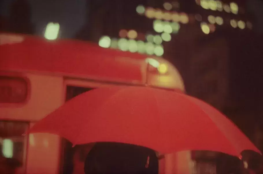
Here are some examples of Saul Leiters photography:


Here are some examples of what I mean by musicians:


PHOTOSHOOT 1
FINN


VICKY/GREYSON |


ANALYSIS 1

This is a photo by Annie Leibovitz, she was born in Waterbury, Connecticut on the 2nd of October 1949, her father was a lieutenant colonel in the U.S. Air Force and her mother was a dance instructor. Leibovitz has also written books, has won awards and has had 3 children. When she was in high school she would also compose and play music, Lebovitz is undoubtedly an extremely creative person, she studied painting at the San Francisco Art Institute and originally planned to become an art teacher. She has many iconic pictures of celebrities but her most iconic one is the polaroid photo of The legendary John Lennon and of Yoko Ono, She Had the chance of not only meeting John Lennon and Yoko Ono, but also take Lennon's last photo ever taken, as the image was taken five hours before Lennon's murder. This photo is considered one of Rolling Stone magazine's most famous cover photographs and a historical image of John Lennon. The photo I'm analysing was a cover for the movie Les Misérables that was made in 2012 however the play was originally made in 1862 which was an adaptation of the Novel made by Victor Hugo. Les Misérables is a French historical novel that's also considered one of the greatest novels in the 19th century. The character in this photograph is called “young Cosette” she's an orphaned child of an unmarried mother and her father who left her to be exploited and victimised though she got rescued by a man called Jean Valjean who treated and raised the young Cosette like his own child.
It's a photo of a young girl that is located on the eastern third of the landscape frame, the photo was taken as a landscape since it was a movie cover and would probably need space for the title of the movie. The still and fixated look of the subject is very strong and has a very resilient and proud stance. It looks like she's been through a lot of traumatic events, I can interpret this because of the dirt she has smeared on her face and her dull but content facial expression. Her facial expression could also represent strength , determination and desperation. It's a really realistic photograph because it's very normal looking, there's nothing out of the ordinary taking place very grounded and level headed nothing abstract or colourful just a girl looking at you. Lebovitz may have positioned the girl to look straight into your eyes to create a sense sympathy for her and to almost get this intimate and familiar connection with her that would almost make you feel bad about her, kind of like looking at an ill puppy. I believe they have made some edits and exaggerations in her eyes, they have edited them to be brighter and to stand out from the rest of the photo, to be frankly honest that was what my attention was drawn to first her big blue eyes. The colour blue has connotations of sadness and melancholy which could be a representative and a reflection of the girls feelings and experiences , the image is basically shrouded in blue as you can see how the colour of the background matches with the colour of her eyes. Not only does it reinforce the connotations of sadness but it also gives a smaller colour palette which soothes the eyes and does not distract you from the main subject and where the photographer intended you to look at. The background is very isolated which also gives a sense of loneliness and abandonment which portrays how the character in the novella/movie/play has been left to rot away and neglected by her own parents. The rough texture on the background may suggest the hard upbringing and life she has had and even the dirty conditions she lived in (as they were dirt poor), the clouds of smoke may represent the clouded thoughts of the misfortunate and also visualizes tough times and could represent distraught and deprivation. Her hair also flows in the wind very peacefully and its almost like a breathe of fresh air in this intensely packed image.
Lebovitz has used the rule of thirds and has placed the girl on the eastern third of a landscape frame. Leibovitz has also used strong leading lines by having the girls strands of her hair across her face which gives the image a flowing/moving dynamic feeling to it, in my opinion it could also show the effects of the weather and the wind which shows good world building and gives us an idea of the surrounding terrain in the movie, world building is an essential skill in every form of medium, that's why the best movies , books , photos , pieces of music and art all have a good structure in how the world they are located in for example, the movie Lord Of The Rings has tremendous world building as its so believable that it could exist and there are no gaps that could bring that credibility down to it which may also represent the genre and the overall feeling the play/movie/book has. I believe that Lebovitz has used a tripod because of how centered and symmetrical it looks, she probably used the tripod for a more professional look too. I also think she has used an ISO of 400 and an auto white balance to make it bright and clean but has edited the saturation of the colours into a more greyish saturation to make the feeling seem dirtier like the mud the girl has on her face. It also makes the image way more mysterious and makes the viewer want to know what it's about more and more and why it's so dark, persuading them to watch/read the play/film/book. In my opinion I don't like it but I don't dislike it either , to me it's a pretty simple image nothing too special but it has followed rules that a photographer should follow which obviously makes it stand out from your ordinary day to day photo. I don't think her work correlates to the work I enjoy and to the work that I want to create so I could also use this as a comparison to the photos I take and edit to compare to what I don't want my work to look like. I want my work to be more asymmetrical and would like it to be more interesting , this image just looks too corporate since it was taken for advertisement purposes and is also just a little boring since there is no background or intriguing lighting.
ANALYSIS 2:

This is really simple but very pleasing and effective to the eye. A photo of a man on the foreground and on the eyelevel of the image fading into a bunch of trees they almost look like a water reflection from out in the wild reflecting on to the subjects body and hair, some facing up and some facing down. The image is drowned in a very sleepy and calming colour, a yellowish , bluish , greyish black and white that channels the tired and kind of sad look on his face and in general the melancholic atmosphere of the picture is very fluidly and softly enhanced around. Although from that sad feeling, you suddenly get pulled from that to be thrown into a feeling of emptiness and loneliness with that grey and monotonous background it really contrasts the dark , sharp and crisp edges of the model's silhouette. It's kind of like the man doesn't belong in that setting. You could kind of interpret it as if he wants to bloom into something better and wants to spread his ideas and feelings. But it's as if he can't because something is holding him back, like his figure or the light grey emptiness/negative space that surrounds him which could symbolize how men are expected to be tough and strong, to not show their feelings and emotions to mask their expressions and creativity in society and what the image of modern masculinity is. its as if its holding back men and young boys from blooming their leaves (like the trees) and not show their passions and feelings which causes mental problems and makes men channel their feelings in immoral ways and they unleash their negative and intrusive emotions that they hold back into atrocities like fighting , bad mouthing and in general try make themselves feel complete and more masculine through degrading everyone else to make themselves look stronger and reinforces them to be submissive to patriarchal views and thoughts. The trees could also symbolize how a man could live vicariously by looking at trees which are an epitome of nature and gives him a feeling of familiarity and conformity which could be interpreted as wanting to break free from society and going back to original roots and values of humanity.
It was taken inside a studio with a pure grey background. It is very stable and does not have a very dynamic motion to it, that's because a tripod has been used to take the photo to make it straight and perfectly angled. But what you get from this is many sweet spots, if you had the guidelines on the photo right now you could see that his nose is placed between 2 lines and his eye is absolute and placed exactly on the middle box. This makes the photo more attractive to other people. As is shown in the shadows and highlights of the photo they are both very distinct. That's because they used an ISO of 400 and an F-stop of f4.0 so that both the bright and dark values of this image can be shown equally. Although the settings of the camera alone wouldn't be enough so they have adjusted this photo in the contrast and brightness settings to make the dark values opaque rather than having a smooth dark value fading into the bright one. For the rest of the edits they found images of trees or even might have taken the image themselves and then inserted them in a layer underneath the photo of the model. Then turned the opacity down on some bits like his body and hair so that you can see the trees bleeding through the image.
I feel very connected with this photo. I don't know what it is but I really like its ambience. I also really like the concept of the trees and I believe it's executed perfectly. I love the vibe of the image. It's very lonely but very beautiful. I also really like the colours because it's not perfectly black and white it's mostly navy blue and white with grey and yellow tints. I believe our work is a bit similar since I've used the contrast and brightness settings for some of my edits and we both try getting the same vibe. I also use the colours yellow and blue a lot as well. To be honest I don't see anything bad with this photo. There aren't any weaknesses, I can only see strengths.
INSPIRATION: Well I might do something similar to this by using other objects or textures in my edits. Like photos I have taken or photos from the internet. But I dont think I'd like to copy the edit completely, although it gives me the inspiration to add things to my images and to give them a bit of complexity and more of a style, rather than just having blandly edited photos.
PLAN FOR SHOOT:
|
Project Title/ shoot number: Media City photoshoot
Description of aims for shoot: I'm aiming to get some photos that will match my mood board. I want to get photos that will match the short of vintage style that I want. Maybe I will also get some photos of people just living not posing for the camera because I love that free unknowing style of photography. Links with Photographers I'm going to try mimicking the style of Saul Leiter. Some key features to his style are blurred lights, dim lighting, sometimes bright popping colours and peoples faces don't really matter but the figure is what should stand out. Also the weather adds a lot of personality and mood to his photos. Location: Media City / Salford Quays Props/ items needed: Humans , bags Kit needed: lighting, tripod, backdrop, macro lens: Camera , SD cards , filter lens , tripod , camera battery , Camera settings I will use: F8 to maybe f4? For those blurry lights and blurry backgrounds I will probably use the setting Shade because i want to get the moody dim lighting i talked about I want a quick shutter speed so I can get those moving shots of people just doing stuff. 200 / 400 I want the darkest possible setting for the same reason the dim light. Which compositional rules will I use: Framing would really give life to a photo. It's also what the photographer I've chosen has done. But if I don't have a window or something to frame the subject I will use a central focal point or the rule of thirds. |
PHOTOSHOOT 2
MODEL 1: ZAIN


BESTI believe that this image here is my best one of this model, this photo has a very smooth and clear quality that's because I used an ISO of 400 which is the reason why the photo has a nice dark tone but also a nice clear quality to it. I also used an auto white balance which didn't exaggerate any light which gave it this cool shadow brownish tint. My shutter speed was f/11 because I wasn't capturing a moving figure which gave me the chance to concentrate on the photo and get a good clear shot of the subject. This photo is not edited although I'm planning on playing with the colour and the lighting of the image in the near future, I used a central focal point so that the model is what stands out the most in the photo I believe I made the right decision doing that because it gives the image a really powerful and confident feel. All in all I'm really proud of this picture and I really like the simplicity but also that nice metal texture in the background.
|

|

|
WORSTI believe that this one here is the worst of this model because of how out of focus this image is. I used an ISO of 800 here which messed up the lighting I also used the auto white balance which was not the problem. the problem was purely me I didn't focus the camera correctly while taking the photo and I also used a shutter speed of f4 which also made it blurry. This photo has not been edited and I'm obviously not going to because the photo itself is bad.
|
MODEL 2: JAVIER


BEST
|
I believe that this image is my best one of this model, this photo has a very clear and bright lighting to it, that's because I used an ISO of 800 which is the reason why the photo has a nice refreshing light but also a nice clear quality to it. I also used a daylight white balance which which exaggerated light which really brought out the fluffy soft clouds and blue sky. My shutter speed was f/11 because I wasn't capturing a moving figure which gave me the chance to concentrate on the photo and get a good clear shot of the subject. This photo is not edited although I'm planning on making an edit of this, I used the rule of thirds and placed my model to the far left of the photo I believe that really helped bring in the background as well as the subject. All in all I really like this picture and think its my best one of that model.
|

|

|
WORST I believe that this one is the worst image of this model because of how close up it is and because of how dark the photo came out that's because I used an ISO of 200 I also used the auto white balance which was not the problem. the problem was my positioning I was to close to the model and the model themselves were not ready to pose. This photo has not been edited and I'm obviously not going to edit it because the photo itself is bad.
|
MODEL 3: VICKY/GREYSON


BESTI believe this one to be my best photo of the 3rd model because of how clear and bright the photo is. The ISO is a 400 which is perfect for bright nice photos I also really love the position of the model and how the hair frames the face from one side to another I believe it makes the photo very dynamic. the expression is very pleasant and flattering I also really like the metallic texture in the background and in general I just think this is a real nice photograph.
|

|

|
WORSTI believe this to be the worst photo I took of this model because the ISO was way too high up to the 1600 so the image was very very bright I also captured my model in a moment were they didn't know I was capturing them so their pose isn't planned and really flattering since they seem to be eating.
|
MODEL 4: THEO


MODELS 5: THEO AND FINN


MODELS 6: JAVIER AND ZAIN


MODELS 7: KOMAL AND ASHOK


PROFFESIONAL SHOOT MOODBOARD


PROFESSIONAL PHOTOSHOOT
|
Project Title/ shoot number: Professional photoshoot #4
Description of aims for shoot: To get a believable music photoshoot Links with Photographers: Charles peterson (he took photos of some of my favourite bands like nirvana , alice in chains and pearl jam) Location: Stretford high school Props/ items needed: Instruments (guitar , bass) Kit needed: Lighting (colourful light and white light) Backdrops Camera settings I will use: F-Stop : F2.8 for that kind of blur while moving White Balance auto Shutter speed: 1/8 and 1/15 for the blur ISO: 400 Which compositional rules will I use? : Asymmetry to add a grunge vibe make it more concert like , leading line (the strings of the instruments) for a more creative point of view worms eye view to seem like I'm in the crowd (non existent crowd) , central focal point (the person playing the instrument maybe someone else playing instrument in the background too.) |
SHOOT WITH A PROFESSIONAL: THE PROGRESS/WHILE WE WORKED


SHOOT WITH A PROFESSIONAL: THE FINISHED RESULTS
MODEL 1: ZAIN (BLACK GUITAR)


MODEL 1: ZAIN (BLACK GUITAR AND MICROPHONE)


MODEL 1: ZAIN (YELLOW GUITAR)


MODEL 2: VICKY MIC


MODEL 2: VICKY GUITAR


MOODBOARD FOR EDITS


EDIT 1
link to video I used to help me create this edit : https://youtu.be/2YYs09Ok4TU


FINISHED EDIT

BEFORE |
AFTER |

for this edit I wanted to give it a vintage poster looking style as if its from a skating magazine so firstly I lowered the saturation till it was white and black then I downloaded a metal texture and defined it as a pattern to make that harsh overlay then I downloaded a halftone texture and also defined it as a pattern to give it that poster vibe then I downloaded yet another texture this time it was a paper like texture to give that magazine look that it came from a page I overlaid it over the photo and the last touch I created a gradient map to give it that yellowish vintage tint.
EDIT 2
Link to the video that I used to help me create this: https://youtu.be/PrxTg0RtGpA


FINISHED EDIT

BEFORE AFTER

For this edit I also wanted to give it a vintage kind of poster like vibe but I wanted to make it a bit different I wanted to give it a bit of colour so firstly I started by lowering the saturation then I lasso tooled my subject and filled the subject in with a blue gradient map then I copied the same layer and gave one of them a gaussian blur effect so that it would have a bit of a blurred outline then I used an overlay mode called exclusion which gave this photo the spark it has. What the exclusion mode did is make those bright bits black, gave it that yellowish old camera looking outline and also added those green parts to all the blue highlights. then I overlaid the same paper screen I had downloaded for the first edit and then my 2nd edit was complete.
Link to the video that I used to help me create this: https://youtu.be/jUmjlv4rb2w
EDIT 3


FINISHED EDIT

BEFORE AFTER

COMBO EDIT 1


FINISHED COMBO EDIT

EDIT 4


FINISHED EDIT

EDIT 5


FINISHED EDIT

COMBO EDIT 2


FINSHED EDIT
FINAL GALLERY


FINAL PRODUCT - CLICK HERE
EVALUATION
I started off with a passion for making retro paper and comic-style looking edits, reminiscent of a bygone era. However, my desire to capture the essence of favourite musicians from the 70s, 80s, and 90s, such as System of a Down, Nirvana, Pearl Jam, Alice In Chains , Soundgarden ,Pink Floyd and BlackSabbath sparked a new direction in my photography project. My journeys evolving style now embraces a diverse range of influences, from retro and vintage aesthetics to gothic themes and music album cover art inspired themes. Nature also plays a significant role in my work, adding depth and texture to compositions. As I delved deeper into my project, I discovered the works of a renowned photographer, Saul Leiter, whose artistry left a lasting impression on my creative process. One of my most profound realisations during this project was that photography transcends digital boundaries. The idea of creating physical edits using my photos opened up new possibilities , a playground of arts and crafts. This shift in my perspective signifies my willingness to experiment and push the boundaries of traditional photography techniques. Moreover, this project served as a valuable learning experience, which honed essential literacy and analysis skills. Through critical examination of compositions, colours, moods, and connotations within other artists images, I gained a deeper understanding of visual storytelling. This newfound analytical approach will undoubtedly enhance the quality and depth of my future projects. Reflecting on my journey, acknowledging the initial challenges and imperfections in my early work. However, with each photo taken and each edit made, I have seen gradual improvements and a growing sense of confidence in my skills. This continuous growth mindset fuels my ambition to further develop and refine my craft in the upcoming projects.
As I look ahead to the future, I'm filled with anticipation and eagerness to embark on new creative endeavours. Each project becomes an opportunity for learning, experimentation, and self-expression. In essence, this first project marks the beginning of a transformative journey , a journey fuelled by curiosity, passion, and a relentless pursuit of artistic growth. With each step forward, I will embrace new challenges, learn from past experiences, and cultivate a unique visual voice that will continue to evolve.
As I look ahead to the future, I'm filled with anticipation and eagerness to embark on new creative endeavours. Each project becomes an opportunity for learning, experimentation, and self-expression. In essence, this first project marks the beginning of a transformative journey , a journey fuelled by curiosity, passion, and a relentless pursuit of artistic growth. With each step forward, I will embrace new challenges, learn from past experiences, and cultivate a unique visual voice that will continue to evolve.
